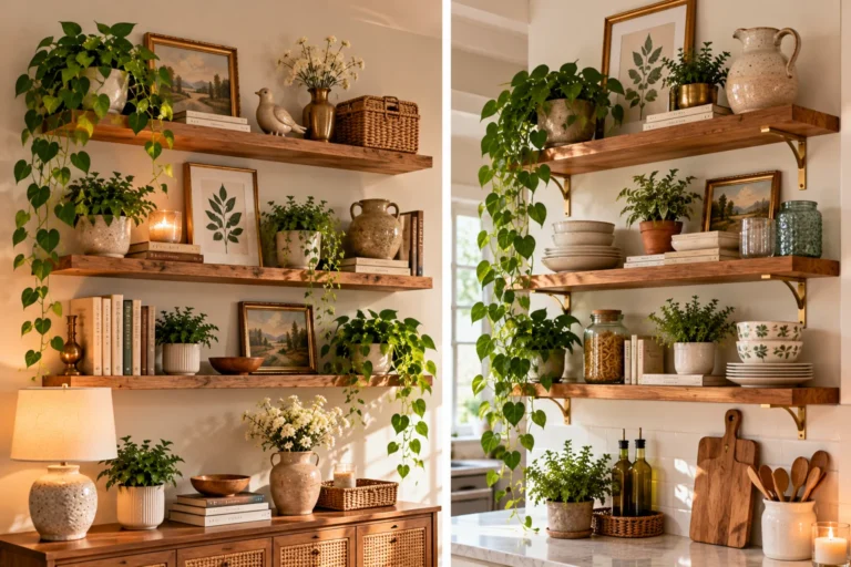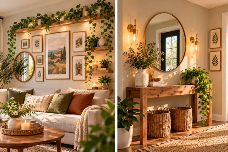
17 Staircase Wall Decor Ideas That Make a Statement

A staircase wall is the biggest blank space most homes never decorate. It is long, it slopes, and it is awkward to hang things on, so many people leave it bare or hang one lonely frame. That is a missed chance, because everyone walks past it several times a day.
These staircase wall decor ideas show how much you can do with one slanted wall. Some use paint, like deep teal, olive paneling, or raspberry pink with gold leaf steps. Some lean on frames, from tidy repeating leaf prints to a packed wall of family photos. Others get creative with an old ladder turned into a bookshelf, a scenic mural, a ledge of trailing plants, or small lights that glow beside each step.
Every idea here works with the slope instead of fighting it. You will see how to space frames, mix finishes, and pick colors that connect the wall to the steps. Start with the one that looks most like your home, then borrow a detail or two from the rest.
1. Green Staircase Walls Make Gold Frames Look Rich
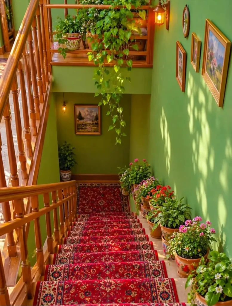
Green walls and gold frames do most of the work here. The wall color is a warm apple green, so the wood railing and the red runner feel like part of one color story instead of three separate things.
- Frames: Three gold framed paintings of landscapes and flowers climb the wall at slightly different heights, with a small round piece above them. They follow the slope of the stairs, so the eye follows too.
- Light: Small lantern style sconces sit on the upper landing and the lower wall. The warm glow makes the green look richer after dark.
- Greenery: A trailing vine spills from the landing, and a row of potted flowers lines the edge of the steps.
One caution. Pots on the steps only work when the stairs are wide enough, and this one keeps them all on one side. Do the same so nobody trips.
2. Dark Stair Walls Make Mixed Frames Look Planned
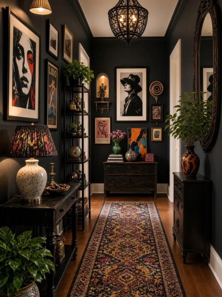
Deep charcoal paint does something light walls can’t. It hides the clutter and lets every frame stand out on its own.
Here the art is all over the place. There are bold black and white portraits, a vintage style poster, a pink Matisse print, and an orange and blue abstract canvas. It still holds together because the wall color stays the same behind all of it.
What works here:
- White mats inside black frames make each piece read clearly against the dark wall.
- A few gold and wood frames break up the black so it never feels flat.
- Warm lamp light and brass touches add glow, so the dark paint feels cozy.
On a staircase, follow the slope of the steps and keep the gaps between frames even. The slanted line is what makes it look planned.
Use white mats so art pops on dark paint.
Mix two or three frame finishes, like black, wood, and gold.
Add a warm sconce or lamp so the wall glows at night.
Skip thin, dark frames with no mat. They disappear into the wall.
Skip hanging every piece at one flat height on a sloped wall.
Skip cool white bulbs. They make dark paint look dull.
3. Vintage Mixed Frames Climb Above Olive Green Paneling
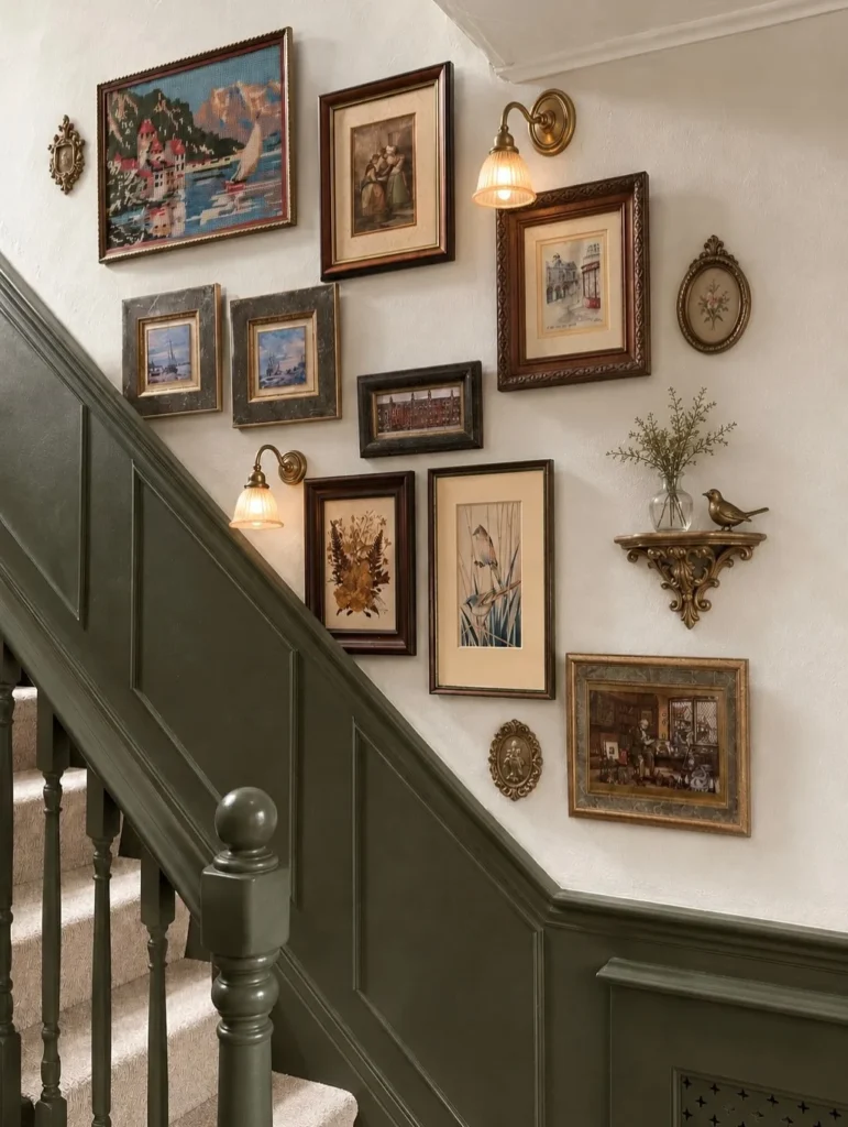
Olive paneling sits low on this stair wall, and the art climbs the cream wall above it. The split keeps the color heavy at the bottom, so the frames get a calm, light backdrop.
The art looks collected over time rather than bought as a set. There is a needlepoint harbor scene, small watercolor style prints, a pressed flower frame, and a bird print on a cream mat. Carved wood, dark stone look, and gold frames all sit together. Small oval brass frames fill the gaps between the big ones.
The details that tie it together are two brass sconces with ribbed glass shades and a little gold bracket shelf. The shelf holds a glass bud vase with greenery and a brass bird. It adds depth so the wall isn’t only flat frames.
Recreate this stair wall
4. An Old Ladder Becomes a Slanted Stair Bookshelf
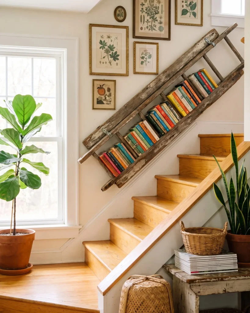
The slope of a stair wall is free shelf space, and this one uses it well. A weathered wooden ladder is mounted at the same angle as the handrail, with books tucked between the rungs. The peeling paint and rough wood look great against the creamy wall and the honey colored steps.
The books do a lot of the decorating. Teal, orange, red, and yellow spines face out in one long row, so the ladder doubles as art. Above it, a small group of botanical prints in thin gold frames keeps the top of the wall from feeling empty.
The corner below stays simple, with a wicker basket on a stack of magazines, a chippy white bench, and a couple of leafy plants.
How to get this look
Find an old wooden ladder with sturdy rails and rungs set close enough to hold books.
Hold it against the wall, match the angle of your stair rail, and mark the line.
Anchor it into wall studs and leave any old metal hardware showing for character.
Fill it with books, spines facing out, and group them loosely by color.
5. A Colorful Gallery Wall Matches Painted Stair Risers
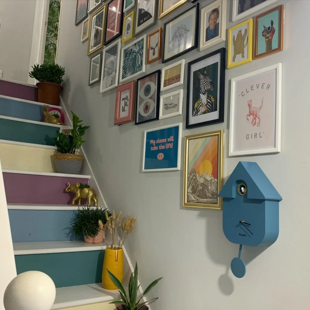
Soft grey paint is the quiet hero here. It lets a loud mix of prints sit together without fighting.
What makes it work:
- The frames come in white, black, gold, yellow, pink, and copper. Using many finishes keeps the wall playful instead of matchy.
- The prints are fun and a little odd, like a zebra in a fancy jacket, a llama in sunglasses, a sunset over mountains, and a bold blue typography print.
- Those colors repeat on the stairs. The risers are painted plum, dusty blue, teal, and pale yellow, so the wall and steps feel connected.
- A blue cuckoo style clock hangs low on the wall as a bold anchor. It stops the frames from drifting into one big block.
Down at the steps, small gold animal figures, a yellow vase with dried grasses, and a few potted plants add height without taking up much room.
6. Pink Paneling and Gold Leaf Steps Steal the Show
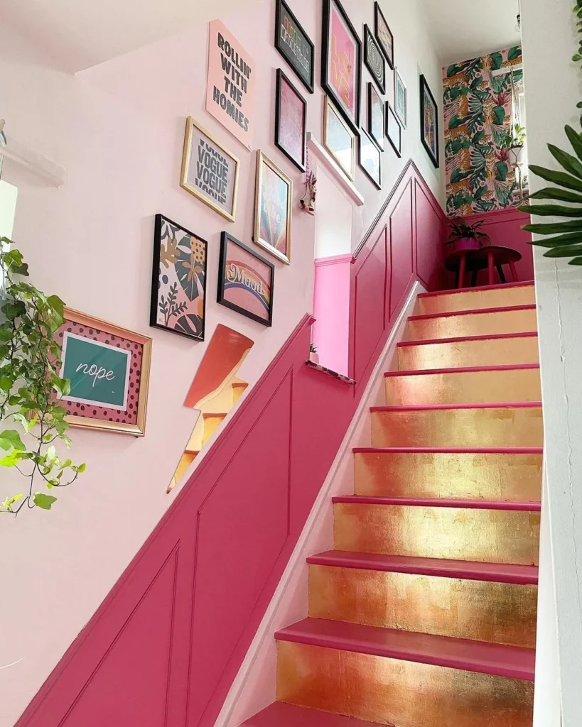
Two paint colors and one shiny finish do the heavy lifting on this staircase.
The lower wall is a deep raspberry pink with simple raised panels, and the upper wall is a soft blush. That split gives the frames a gentle background while the bold color stays low. The risers look like gold leaf, with a hot pink edge on every tread, so each step catches the light.
What works here:
- Black frames carry most of the gallery, with a few gold ones mixed in. The black keeps all that pink from getting sweet.
- The prints are loud and funny, with bold type, a rainbow, a leafy pattern, and a short “nope” print in a polka dot mat.
- A lightning bolt shaped piece sits at the lower edge of the group and breaks up all the rectangles.
- Tropical tiger wallpaper at the top of the stairs gives the eye a reason to keep climbing.
Keep the frames close to the rail and let them rise with the slope. That pulls the gallery and the paneling into one diagonal line.
A bold color on the lower wall and a light shade above it lets loud art stay readable. Add one metallic detail, like gold steps, and the whole staircase feels finished.
7. Soft Neutrals and Botanical Prints Warm a Stair Landing
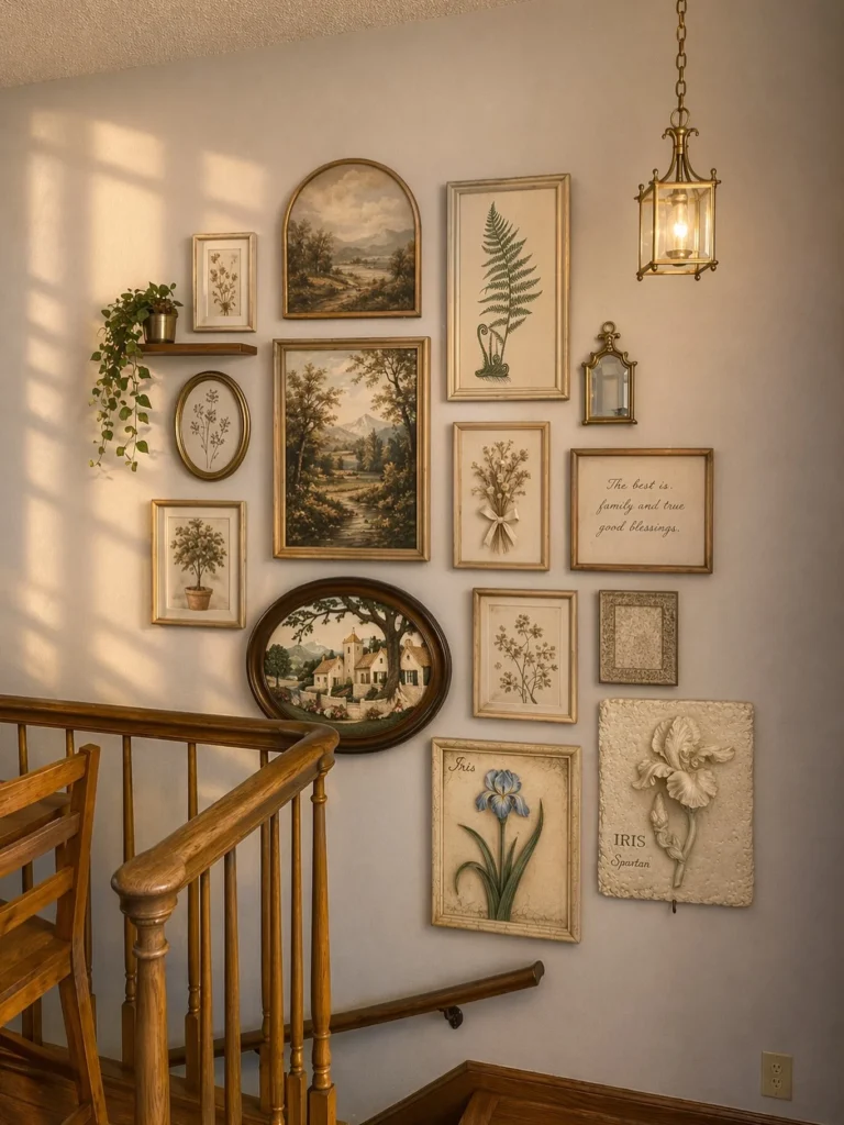
Late sun throws window shadows across this wall, and the art is picked to match that glow. Everything leans cream, tan, olive, and soft gold, with one hit of blue from an iris print.
Nothing here is loud, so the wall relies on shape and size to stay interesting. An arched landscape painting sits above a tall one, a fern print stands upright beside them, and an oval village scene curves around the banister. A small floating shelf with a trailing plant and a tiny brass mirror fill the gaps.
A brass lantern pendant hangs just beside the group. It adds warm light and a bit of height, so the art doesn’t float alone on a big wall.
Here is how the two main groups of pieces split the work:
| Big anchor pieces | Small filler pieces |
|---|---|
| Landscape paintings and an oval village scene | Pressed flower prints, a script quote, a tiny mirror |
| Hang these first, near the center of the group | Add these last, wherever a gap shows up |
| Give the eye a place to rest | Add detail and keep the edges loose |
8. Tiny Wall Lights Make Framed Leaf Prints Glow
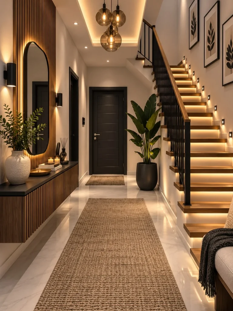
Here the lighting is part of the wall decor. Small square lights are set into the wall and follow the slope of the stairs, one beside each step. They wash the cream wall in a soft glow and keep the whole stairway readable at night.
Three tall prints hang above them in thin black frames, each with a wide cream mat and a single dark leaf. The repeat is the trick. Same frame, same size, same subject, so the wall feels calm and tidy instead of busy.
The rest of the picture supports it:
- Warm wood treads and a wood handrail echo the golden light.
- Black balusters and frames keep the look crisp.
- A glowing strip under each tread adds a second layer of light below the wall lights.
Pick one leafy print style and repeat it three times, then let the lights do the styling.
A plain stair wall with three framed prints, lit only by a ceiling fixture. The art looks flat after dark.
Small wall lights run beside the steps, so the same prints get a warm glow and the stairs feel safer.
9. Scenic Mural Wallpaper Turns a Staircase Wall Into Art
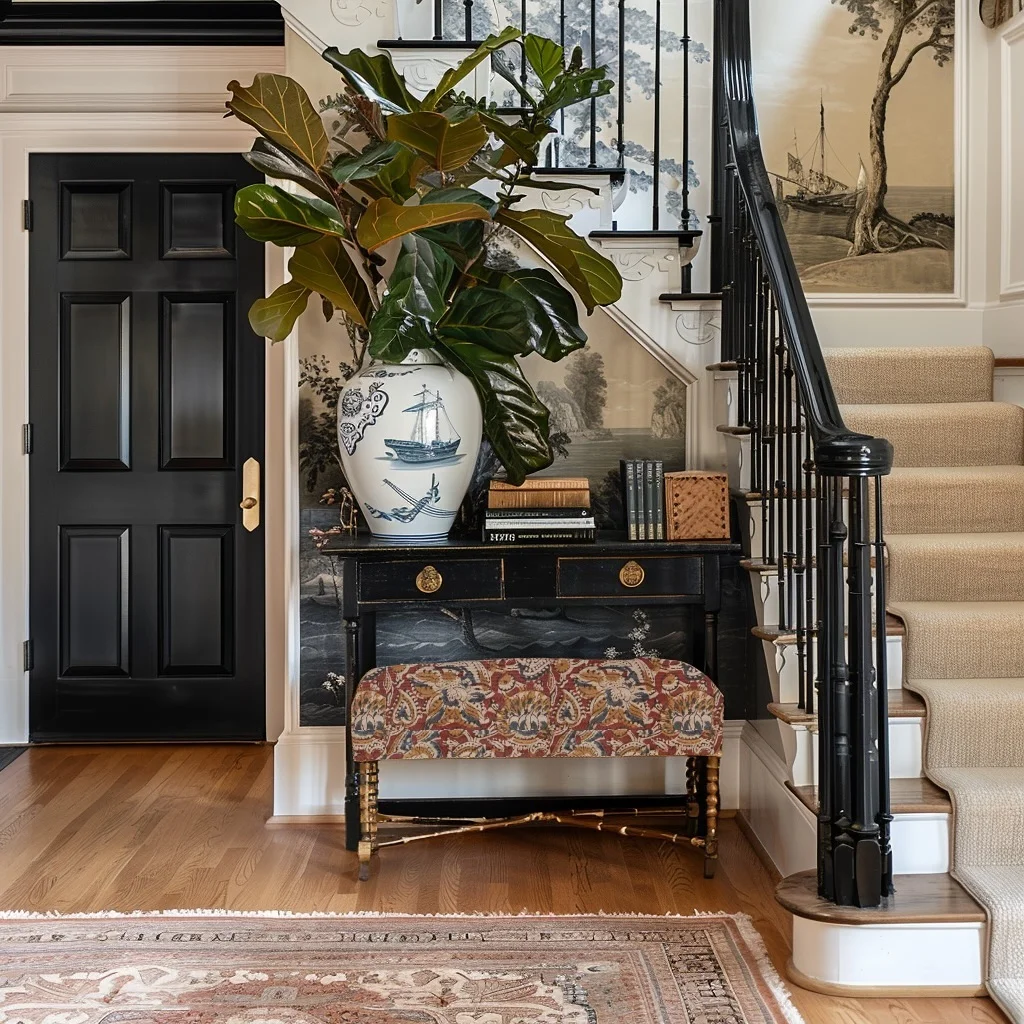
Skip the frames and cover the wall itself. The stairs and the nook beneath them are wrapped in a soft grey and cream landscape scene with trees, water, and a sailing ship. It looks like a scenic wallpaper or mural, and it gives the stairwell a quiet, painted feel.
A black console sits right against it, which keeps the look grounded. On top, a white vase with a blue ship design holds a big fiddle leaf style plant. The ship on the vase echoes the one on the wall, so the two pieces feel chosen together.
The details that finish it:
- A short stack of books and a woven box add texture without clutter.
- A bench with a red and gold floral cover tucks underneath, adding the one warm color in the scene.
- Black balusters and a glossy black door keep the look sharp against the pale wall.
💡 Quick Tip
Pick a mural in one or two muted colors, then repeat a small detail from it on a decor piece nearby. Here, a ship on the wall shows up again on the vase. That small echo makes the whole corner look planned.
10. Warm Wood Frames and Wide Mats Follow the Banister
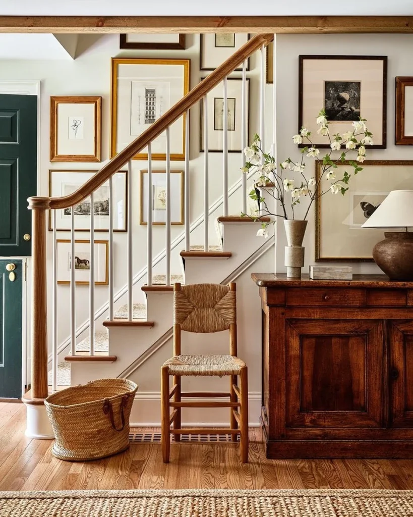
The art here climbs right along the handrail. Each frame sits a little higher than the one before, so the wall and the stairs read as one slope.
Why it feels calm even with so many pieces:
- Almost every frame is wood or soft gold, so the group stays in one warm color family.
- The mats are wide and creamy, which gives each small sketch room to breathe.
- The art itself is quiet. There are ink drawings, an old building print, a horse, and a butterfly, all in muted tones.
The wall is a soft white, so nothing competes. The wood handrail, the rush seat chair, and the woven basket repeat the same honey tones, and a dark wood cabinet adds weight on the right.
Tall branches in a stone vase bring in a little height and a hint of white without crowding the frames.
- ▸Start with the biggest frame near the middle of the wall.
- ▸Keep the gaps between frames about the same, close to two inches.
- ▸Choose wide cream mats so small prints still look important.
- ▸Stay with wood and gold frames so the group looks like one set.
- ▸Add a basket, a chair, or a console below to ground the wall.
11. Layer Plants and Art for a Living Stair Wall
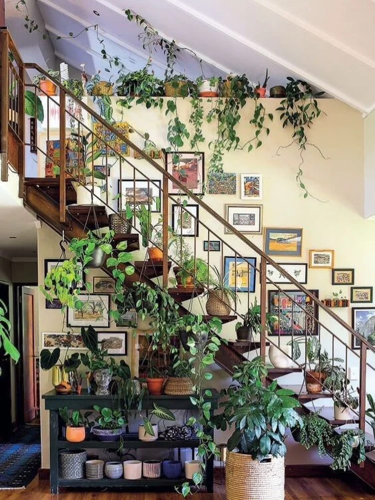
Vines are the main decor on this staircase, and the art plays a supporting role. Plants sit at three heights, so the whole wall feels full without feeling cramped.
Top: A narrow ledge near the ceiling holds pots of trailing greens. The vines spill down the wall like a leafy curtain.
Middle: Small framed pieces in black, wood, blue, and gold step up beside the railing. Colorful landscape style prints and a few bright abstract ones keep the cream wall lively. Vines weave through the gaps, so the art and plants overlap.
Bottom: A dark green console holds pots in cream, pink, blue, and terracotta. A big woven basket with a leafy plant anchors the corner.
The plants sit on the open steps too, tucked close to the wall. That keeps the walking space clear. Check for water drips before you do the same on wood stairs.
A high ledge with trailing vines that fall down the wall.
Small framed art that steps up beside the rail, with vines weaving through.
A console with mixed pots and a big basket planter to anchor the corner.
12. Deep Teal Walls Make Gold Frames and Mirrors Pop
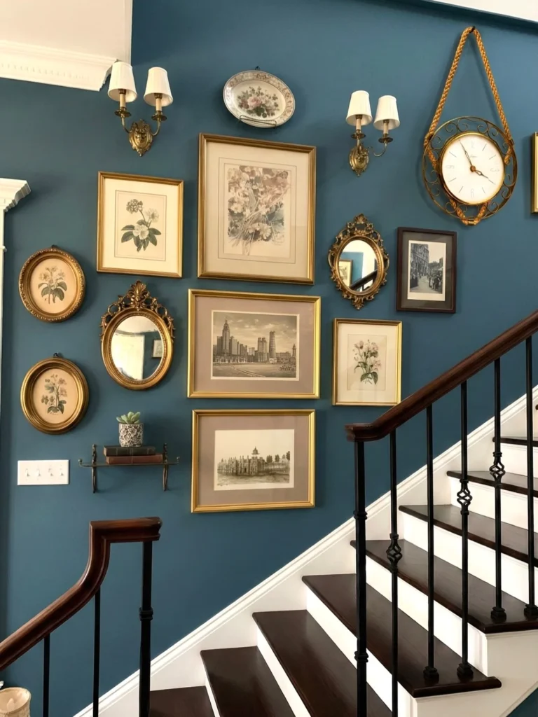
Gold looks richest against a dark, moody blue, and this wall proves it. The paint is a deep teal blue, and nearly every frame is gold, so the group reads as one warm collection on a cool backdrop.
The mix is where it gets interesting. Tall flower prints sit beside wide city drawings with taupe mats. Oval frames line the left edge, and two ornate gold mirrors bounce light back across the stairs. One dark wood frame with a black and white street photo breaks up all the gold.
Not everything is a frame, either. A painted plate hangs at the top, a brass clock swings from a thick rope, and a tiny iron shelf holds old books and a small succulent. Two brass sconces with pleated shades sit above the group and light the paint at night.
Look at the switch plate on the left. It stays right where it is, and the frames simply work around it. Don’t hide a switch behind art you will need to move later.
13. Seascape Art Fills White Paneled Walls With Coastal Charm
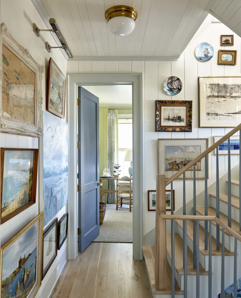
Two walls, two moods, one theme. The hallway side holds big, loose paintings, and the stair side holds smaller, tidier pieces. All of it is about the sea.
Hallway wall: Large frames in whitewashed carved wood, dark wood, and gold hang close together. A big textured painting in pale blues sits between them with no frame at all. A slim metal picture light over the top frame gives the art its own glow.
Stair wall: Ship plates and small framed harbor scenes climb above the rail. A few carved wood and gold frames hold ink drawings and watercolors of boats. The plates add round shapes, so the wall isn’t all rectangles.
The white vertical paneling keeps it airy, and the pale blue door and railing posts pick up the blues in the paintings. Light oak steps and floors warm it up.
Colors on this wall
14. Family Photos in Mixed Frames Fill a Tall Stairwell

Photos can carry a whole stair wall if the frames do the styling. This stairwell is stacked nearly to the ceiling, so the eye keeps traveling up with you.
Most of the photos are black and white portraits, with a few color shots tucked in. That keeps a crowded wall from looking messy. The frames do the mixing instead. There are gold ones, warm burl wood, a dark wood frame, and a couple of white ones, and most have wide cream mats. A striped mat on one small frame adds a little pattern without shouting.
The railing gets dressed too. A leafy garland dips along it with pears, apples, and oranges, plus striped and mustard velvet ribbons tied in loose bows. The fruit colors echo the warm gold of the frames.
Hang the frames from the lowest point first, since they get harder to adjust once you climb the stairs. Use a stable ladder and a helper for the upper rows.
Frame mix on this wall
15. Vintage Landscape Paintings Climb the Rail Above a Dresser
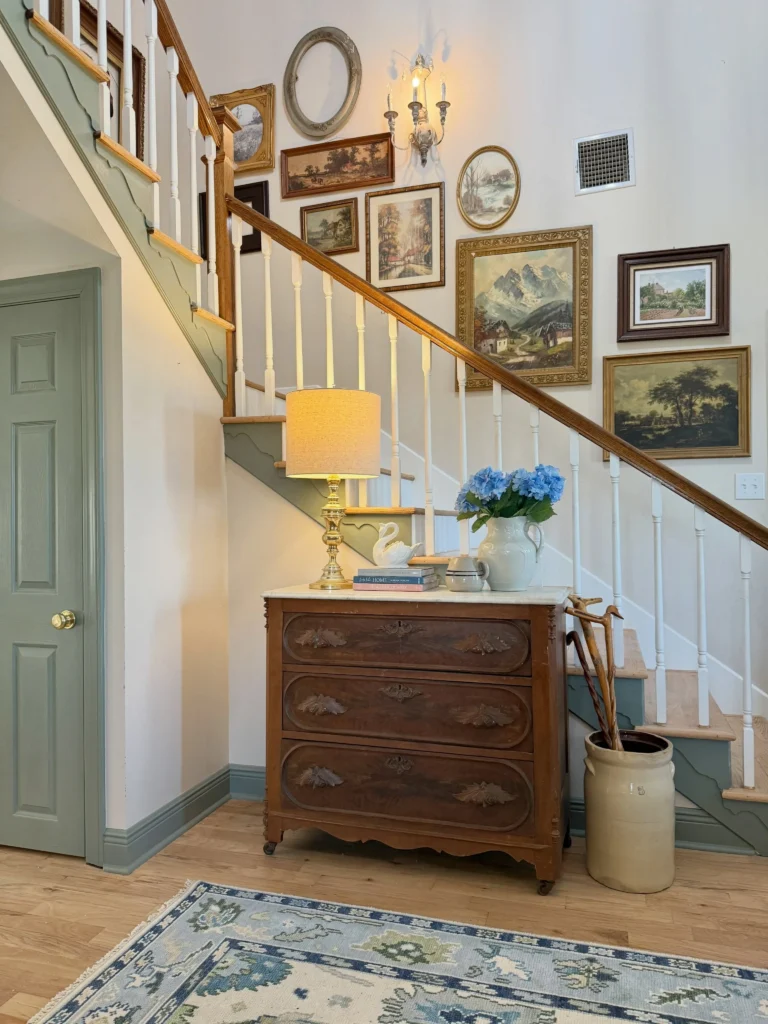
One empty oval frame hangs at the very top of this group, with nothing inside it. It works as a shape, not as art, and it keeps the top of the wall from feeling stiff.
Below it, the paintings are all old style landscapes. There is a mountain village in a carved gold frame, a tree lined road in a thin wood frame, a garden scene in dark wood, and a small oval watercolor. They are different sizes, but the soft greens, golds, and browns tie them together. A white sconce with crystal drops sits in the middle, so the group has light of its own.
The dresser below finishes the picture. A brass lamp, a white pitcher of blue hydrangeas, a few stacked books, and a crock of walking sticks sit on and beside it. The sage green door and trim repeat the green in the paintings.
Hang one near the top, even if it stays empty.
Use one or two as the heavy pieces near the rail.
Place one in the middle to add height.
Set it in the center so the frames surround it.
16. Abstract Art Wraps the Corner Beside the Staircase
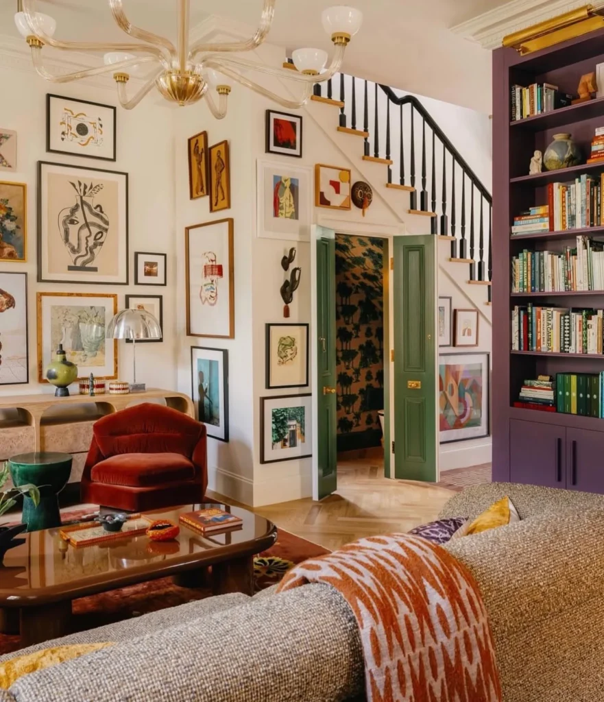
Cream walls do the quiet work here, so the color can happen everywhere else. The art starts in the living room, turns the corner, and keeps going right up to the stair opening.
The frames are mostly thin black and warm wood, and the prints are loose and graphic. There is a bold vase line drawing, a few abstract figures, and a green and teal scene. The mix of tall, wide, and small pieces keeps your eye moving. Small sculptural pieces hang with the frames too, like a carved mask and two dark wall hands. They add texture that flat prints can’t.
The wall and the room share the same colors. The green double doors, the purple built-in shelves, and the rust velvet chair all show up in the art. Even the space under the stair slope gets a few frames, so no wall is left empty.
Here is a quick way to copy the idea:
Pull two or three colors from the room into your prints.
Let the art turn the corner instead of stopping at it.
Add one or two small objects, like a mask or wall sculpture.
Skip matching every frame. Two or three finishes are plenty.
Skip hanging art over the door swing, where it can get hit.
Skip painting the wall a bold color if the art is already loud.
17. Black Stairs and Monochrome Art Make a Bold Gallery
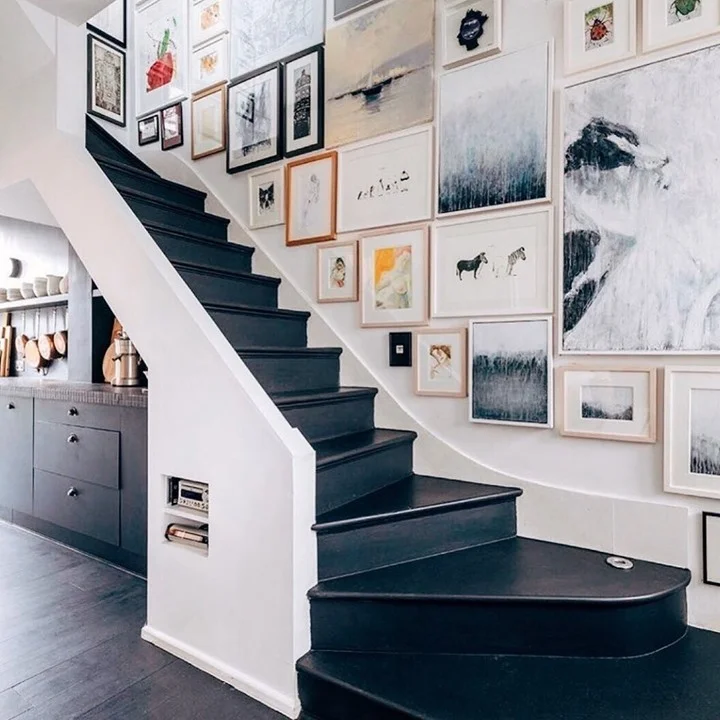
Dark steps can hold a whole room together. Here the treads and risers are painted a deep charcoal, the wall stays bright white, and the art picks up both shades.
Most pieces are black, white, and grey. There are misty landscapes, a big brushy abstract canvas, and small animal prints with zebras and a cat. Frames are light wood or white, so they never fight the dark stairs. Then a few small color moments break the pattern, like an orange and yellow figure, a red ladybug, and a pink sketch.
The wall curves as it climbs, and the frames follow it instead of cutting a straight line. That soft bend is what makes the group feel built for this stairway.
Charcoal on both treads and risers gives the room a strong base.
Black, white, and grey prints in light wood or white frames.
Use small prints in orange, red, or pink so the eye has a few places to land.
Conclusion
A stairway does not need a big budget to look finished. Pick one color, one frame style, or one clever object, and build around it. Follow the slope, keep your spacing even, and add a little light so the wall looks good after dark.
If you are still stuck, go back to the entries that felt closest to your own stairs and borrow just one detail. That is usually enough to get started. Save this post for the next time you want fresh staircase wall decor ideas, and come back to it when you are ready to hang your first frame.