12 Gallery Wall Ideas for Every Room in Your Home

A blank wall above the sofa can sit empty for years because nobody knows where to start. Hang the wrong thing and it looks like a mistake, so most people hang nothing.
The good news is that there’s no single rule for building one. The twelve rooms below prove it. Some are packed from the sofa to the ceiling, and some use just two prints and a few floating shelves. One skips frames entirely and relies on texture. Another puts tiny photos inside giant colored mats. Others lean on dark navy paint, old gold frames, or a hot pink and forest green palette that shouldn’t work and does.
If you’ve been hunting for gallery wall ideas that fit a real room, like a living room, a hallway, a corner desk or a narrow wall by a window, there’s a layout here to borrow. Each idea comes with the small details that make it work, such as frame choices, spacing and color repeats, plus a quick visual you can scan on your phone.
Scroll through, pick the one that matches your wall, and start with your biggest piece.
1. Let Colorful Art Run Wild Above the Sofa, Then Tame It With One Frame Style
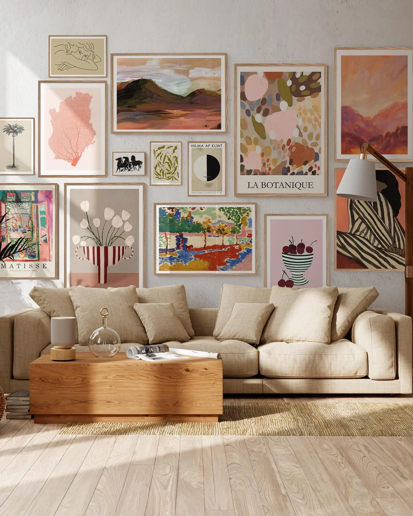
More than a dozen prints, no two alike, and the wall still looks planned. Here’s why it holds together:
- One frame finish. Every print sits in a thin, light wood frame, so the art can vary as much as it wants.
- A repeating palette. Blush pink, rust, olive green and cream show up again and again, from the coral print to the big abstract piece to the landscapes.
- A small repeat motif. Look for the stripes on the vase, the cherry bowl and the shirt. Three small echoes make the mix feel chosen.
- Big and tiny together. A few large prints anchor the wall, and little ones fill the gaps between them.
- Tight, even spacing. The gaps stay narrow all the way across, so the whole thing reads as one shape.
Start with your largest print, then build outward and let the small frames fill the leftover space.
2. Hang Plates and an Empty Frame for a Collected-Over-Time Gallery Wall
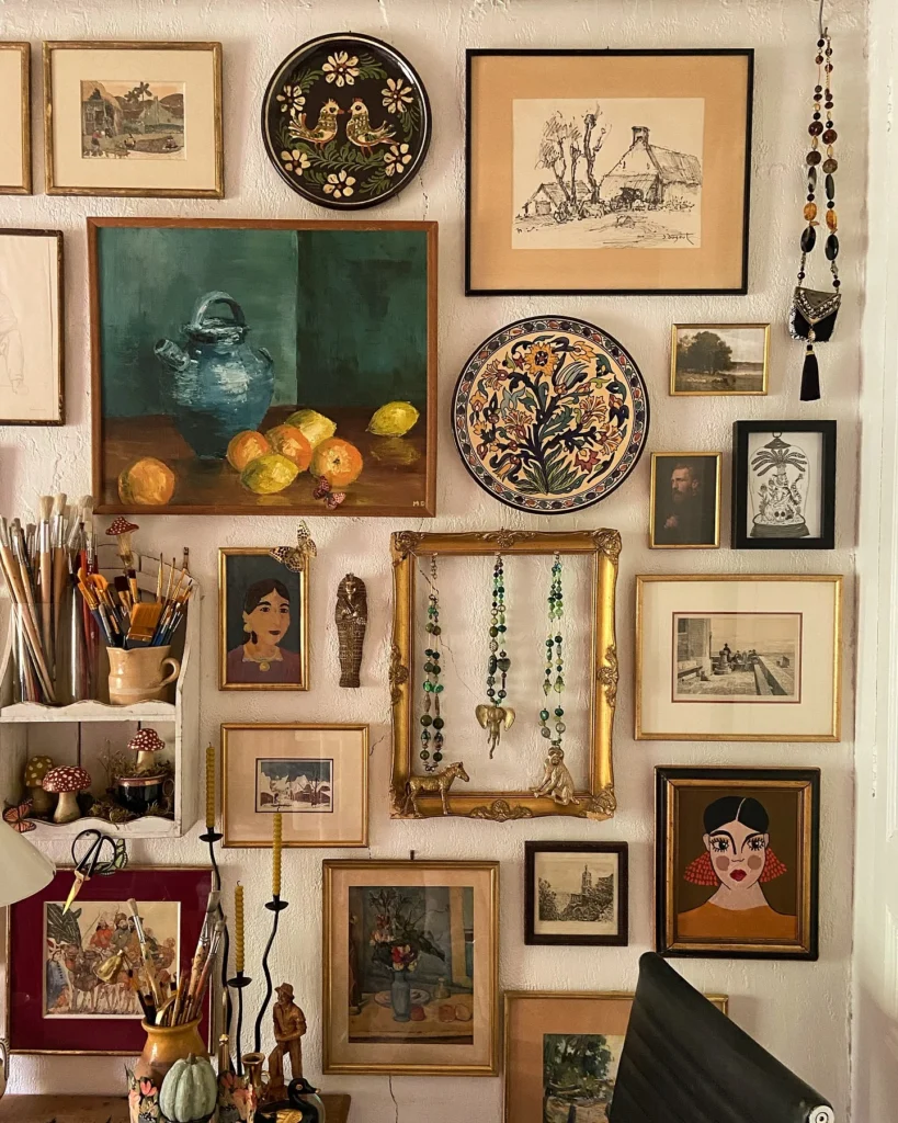
Old gold frames, dark wood frames and a couple of painted plates, all packed onto one wall beside a work desk. Nothing matches, and that’s the charm. The warm gold and wood tones tie everything together, and the green and teal in the still life show up again in the plate and the beads.
The best trick is the empty ornate gold frame near the center. It holds green beaded necklaces and a few small brass animals, so it works like a tiny shelf. Paint brushes, a small shelf of mushroom figurines and a few candlesticks sit right under the art, so the wall flows into the desk.
Skip the ruler. Spacing here is loose and a little uneven, and it still looks right because the colors repeat.
How to build a collected wall like this
Pick one warm frame tone, like gold or aged wood, and let the sizes and shapes vary.
Place the biggest painting first, then hang plates between the frames to break up the rectangles.
Hang one empty frame and drape beads or small trinkets inside it as a mini display.
Repeat one color, such as green or teal, in at least three spots across the wall.
3. Try a Grid of Black-Framed Posters When You Want Bold Color Without the Mess
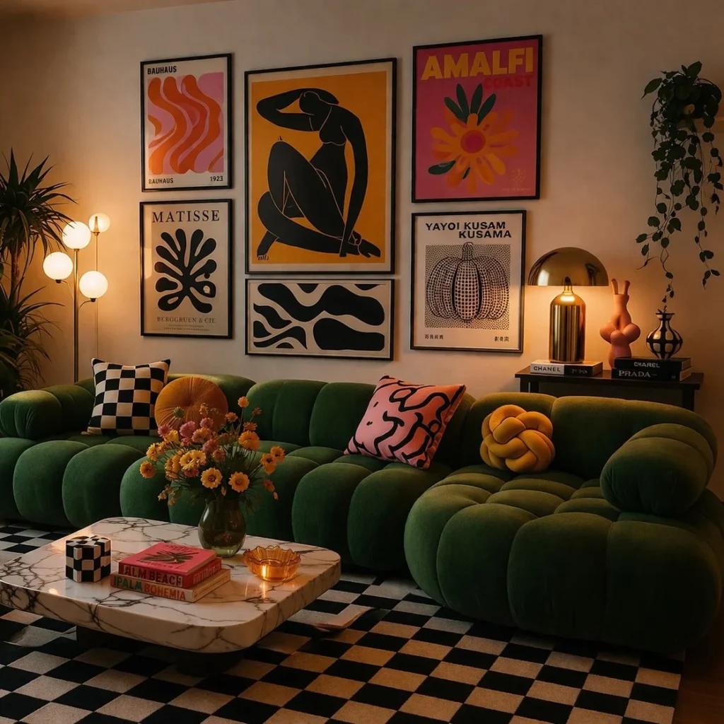
Six posters, all in thin black frames, hung in a tidy block. The art is loud, with orange waves, a mustard-yellow figure and a hot pink floral. The black frames and even gaps keep it calm.
The big mustard print sits in the middle and sets the size for everything else. The smaller prints stack on either side, and a wide black and cream print fills the space underneath. The edges line up, so the whole thing reads as one big rectangle.
The wall also picks up colors from the room. The pink and mustard repeat in the pillows, the black and cream shows up in the checkered rug, and the warm glow from the globe lamp makes the orange pop. A grid like this gives bold art a calm structure.
Use one frame color for every print.
Keep the gaps between frames the same width.
Repeat two art colors in your pillows or rug.
Mixing several frame colors in a tight grid.
Letting the edges zigzag.
Hanging a loud print with no matching color nearby.
4. Pair Floating Shelves With Two Framed Prints for a Gallery Wall With Living Things
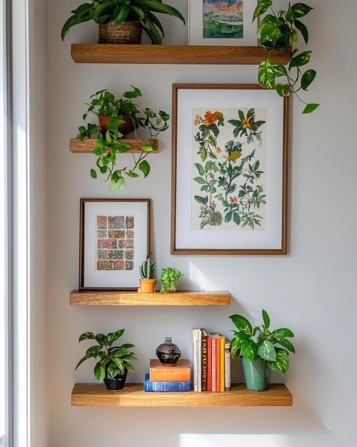
Not every gallery wall needs a dozen frames. This narrow wall by a window uses four light oak floating shelves and just two framed botanical prints, and it still reads as a full display.
The prints do the anchoring. One large leafy illustration hangs on the wall, and a smaller colorful pattern print leans on a shelf, so some art hangs and some sits. Trailing plants spill over the shelf edges and soften the straight lines. A short stack of orange and blue books, a small dark vase and a green ceramic pot add color without crowding anything.
Matching thin wood frames and white mats keep the art quiet, so the greens stay the star.
Pieces to recreate this shelf wall
5. Skip the Frames and Build a Hallway Gallery Wall Out of Texture
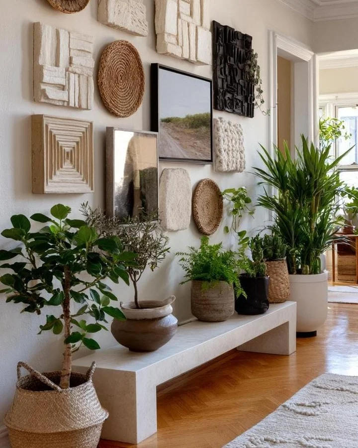
Almost nothing on this wall is a picture. Cream relief panels, round woven discs and one dark carved piece do the work, and a single framed landscape photo sits in the middle like a window.
What makes it work:
- Tone on tone. Cream, tan and straw colors cover most of the wall, so the shapes carry the look instead of color.
- Shape variety. Squares, circles and a rounded stone-look slab keep the eye moving.
- One dark spot. The black carved panel near the top adds weight, and the black frame of the photo echoes it lower down.
- Shared materials. The woven discs match the baskets and planters on the floor, so the wall and the bench feel like one scene.
A low stone bench underneath holds pots of different heights, which makes the whole corner feel layered. Hang the textured pieces first and add the one framed print last, so you know exactly where it needs to go.
| Framed prints | Textured pieces |
|---|---|
| Add color and a story | Add depth and shadow |
| Flat, so they sit close to the wall | Stick out, so leave room around them |
| Best as one anchor piece | Best in a group of five or more |
| Work well in any room | Suit hallways, entries and calm neutral rooms |
6. Let One Big Vintage Poster Lead a Wide Gallery Wall Above a Long Sofa
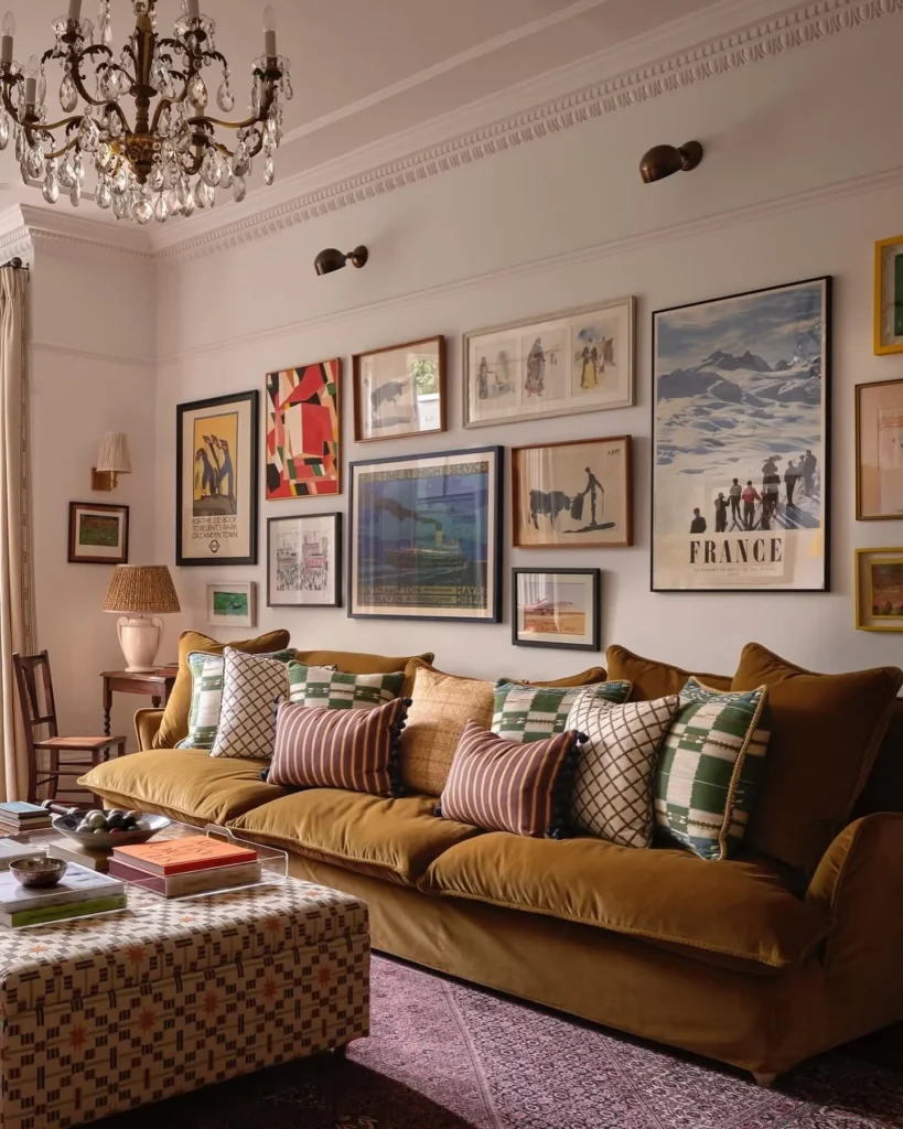
Tall ceilings can make a gallery wall feel lost. Here the art stays close to the sofa and spreads sideways, so it fills the width of the couch instead of climbing the wall.
The France ski poster is the biggest piece, and it sits at the right end like a bookend. Smaller pieces step down toward the left, including a ship poster, two bullfighter sketches and a bold red geometric print. Frames are a mix of black, wood, white and bright yellow. The mix works because the art leans on the same few colors, and the mustard sofa and green patterned pillows pick up the yellow and green from the frames and prints.
Notice the frames hang at different heights, but the bottom edges stay roughly level above the sofa back. That keeps the wall from feeling like a scatter of pictures.
Two small brass wall lights sit above the art and add a warm glow in the evening. They also draw the eye to the wall.
Start with one oversized print, then step the sizes down and keep the bottom edges close to the top of your sofa.
7. Put Tiny Photos Inside Oversized Colored Frames for a Gallery Wall That Feels Like Art
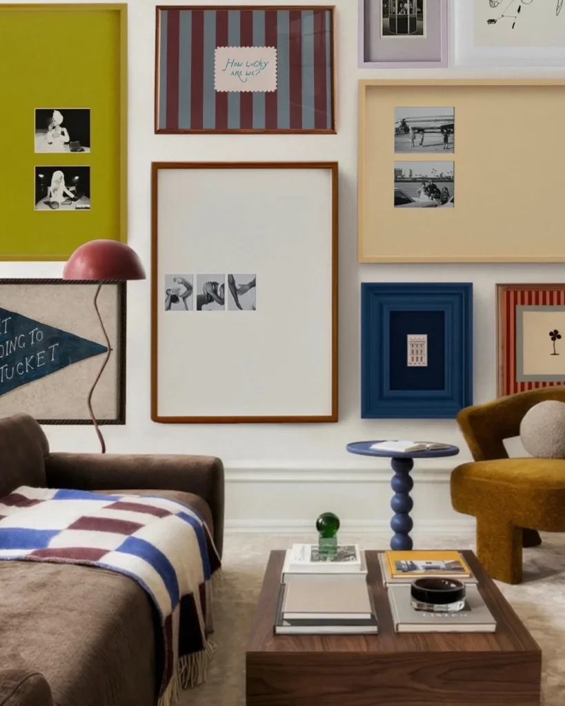
Small photos, huge frames. That’s the whole trick on this wall, and it’s the opposite of the usual rule of filling every frame edge to edge.
Wide mats in olive green, soft peach and plain white leave lots of empty space around two or three small black and white photos. The empty space becomes part of the art. A chunky navy frame with a deep inset holds one tiny building print, and a striped burgundy and blue-gray piece adds pattern between the quieter ones.
The color plan is easy to copy. The frame and mat colors come from the room itself. Navy shows up again in the side table and the throw, burgundy in the lamp and the stripes, and mustard in the armchair. Pick colors you already own and have your frames match them.
One caution: oversized mats need good photos. Black and white keeps a mix of subjects from looking messy.
8. Fill the Wall to the Ceiling With Light Oak Frames and Abstract Prints
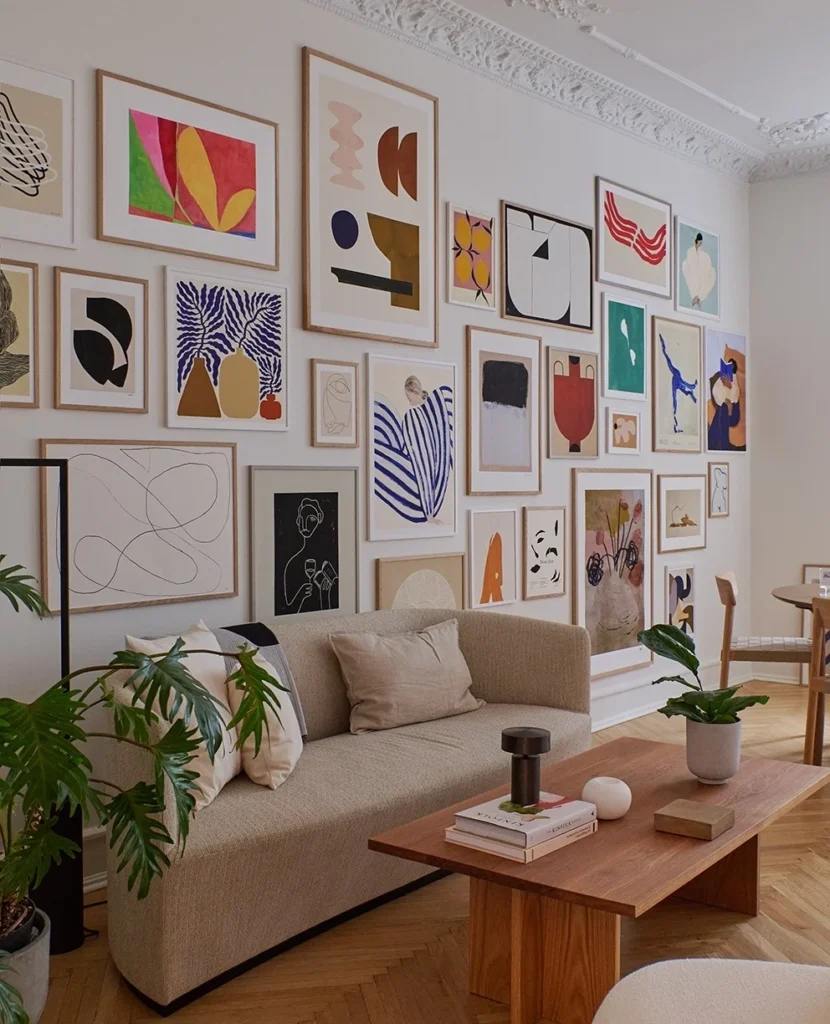
Two dozen or so prints, and not one gap feels like an accident. This wall climbs nearly to the ornate ceiling molding, and the art stays quiet enough to keep a plain beige sofa in front of it from disappearing.
Frames: Every frame is a thin, light oak, and almost every print has a wide white mat. That repeated border does the heavy lifting.
Art: Most prints are abstract or loose line drawings, with a few figures and vases mixed in. Blue, red, orange and mustard keep returning, so your eye jumps around the wall without getting lost.
Layout: Tall prints and wide ones are stacked in uneven columns, with tiny frames tucked into the gaps. Spacing stays tight and even from edge to edge.
The sofa and coffee table are kept calm on purpose. With this much color overhead, the furniture only needs to be a soft neutral and a warm wood.
💡 Quick Tip
Lay your prints on the floor first and arrange them into one big block. Trim the layout until the outer edge looks steady, then hang from the center outward.
9. Hang Your Gallery Wall on a Dark Navy Wall and Let Gold Frames Glow
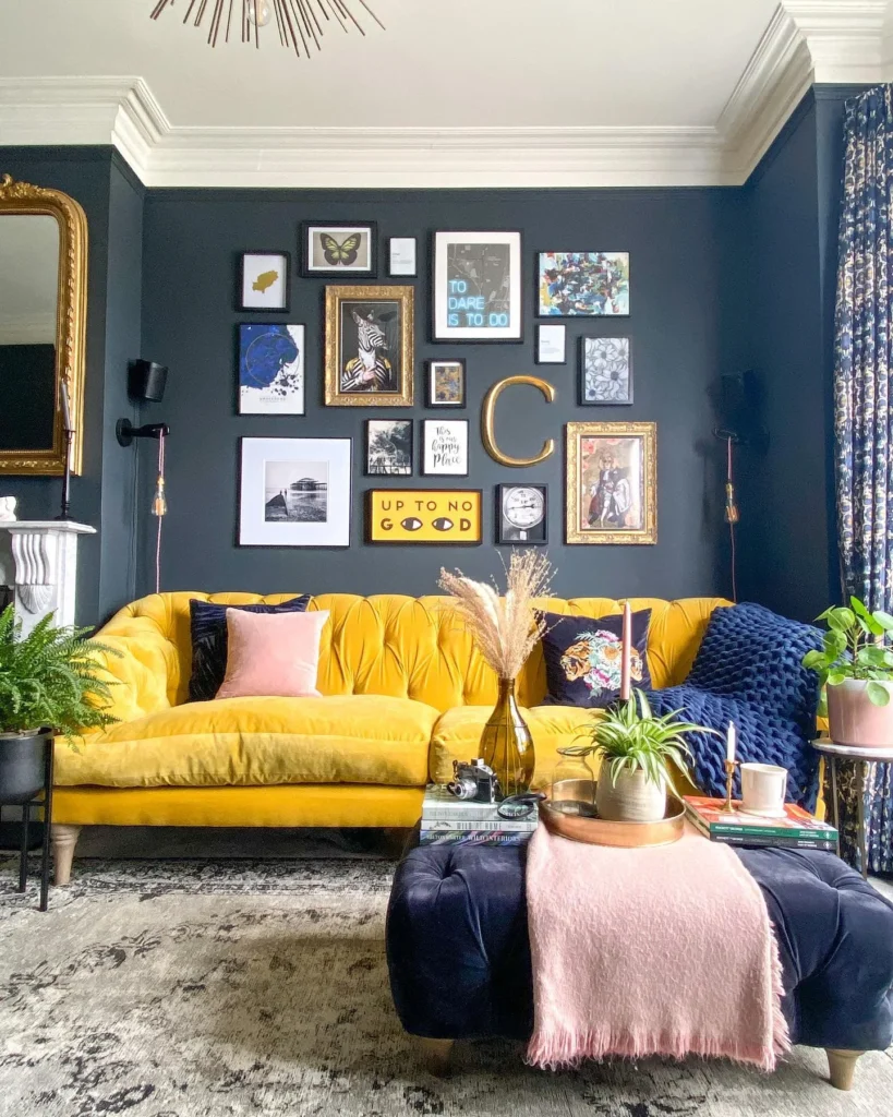
Dark paint is the secret here. The deep navy wall makes everything on it look sharper, and the art doesn’t have to be fancy to look rich.
The frames fall into two camps, and the mix is what makes it work:
- Plain black frames hold the modern pieces, like the butterfly, the neon-style quote print, the bright abstract and the small word prints. They fade into the wall and let the art speak.
- Ornate gold frames hold the two quirky animal portraits, one with a zebra head and one in a flowery, vintage style. They catch the light and give the wall some old-world drama.
A big gold letter sits right in the middle of the group, and it acts like a frame without a picture. Little frames fill the gaps, and a bright yellow print near the bottom echoes the sofa below.
Gold shows up in the mirror, the letter and the frames, while pink and yellow keep the dark wall from feeling heavy.
Frames and prints blend in softly. Busy mixes can start to feel crowded.
Gold edges glow, white mats stand out and a mixed collection looks planned.
10. Wrap a Small Gallery Wall Around a Corner and Tie It to a Work Nook
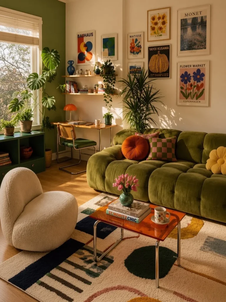
Corners are awkward, and this room treats that as a bonus. Two small groups of prints sit on two different walls, and together they make one gallery.
The first group hangs above a pair of floating wood shelves and a slim desk. Two prints sit above the shelves, which hold books, a blue vase and a few small objects. The second group is on the wall above the sofa. It has six prints in thin white and pale wood frames, including a sunflower print, a Monet-style pond scene and a pumpkin poster on black.
The room does the color matching for you. Orange from the prints returns in the desk lamp, the glass coffee table and the round sofa pillow. The pink and green checks on one pillow echo the floral prints. Because the frames stay thin and light, the olive sofa and the green wall can stay the main event.
- ▸Split the art into two groups, one for each wall of the corner.
- ▸Place floating shelves under the smaller group so the art and the objects feel connected.
- ▸Keep the frames thin and light so a bold sofa or wall color still leads.
- ▸Pull one print color into a lamp, pillow or vase on the other side of the room.
11. Mix Vintage Botanical Prints With a Round Mirror for Old-World Charm
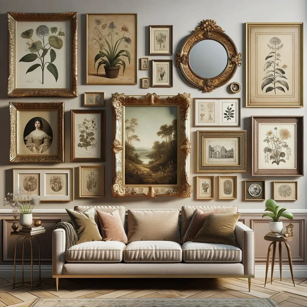
Think of this wall as a small museum hall. Soft taupe paint sits behind pressed-flower style prints, a moody landscape and one oval portrait, all in carved gold and antique wood frames.
The big landscape in the center has the fanciest cream and gold frame, so it acts as the anchor. Tall botanical prints in the corners balance it, and a round gold mirror up top breaks the pattern of rectangles. Tiny frames fill every gap in between, which keeps the wall dense without looking crowded.
Color stays quiet. Cream paper, sepia ink and soft green leaves repeat across the prints, and the gold in the frames shows up again in the sofa legs and the side tables. Blush and olive pillows pull the wall’s softest colors down into the room.
One thing to watch: a mirror reflects whatever it faces, so check what it will catch before you nail it up.
Give every piece a job
12. Pair a Forest Green Wall With Hot Pink and Black Frames for a Gallery Wall With Attitude
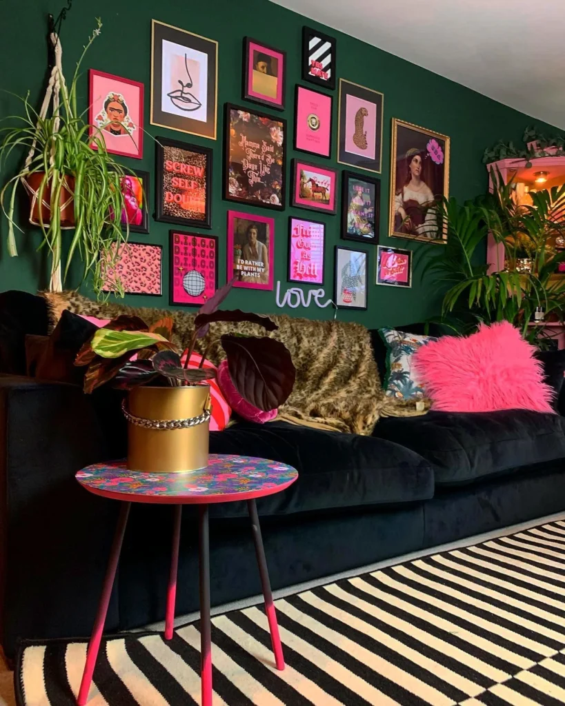
Loud color works when you only use a few of them. Here it’s deep forest green, hot pink, black and gold, and nothing else gets a vote.
The frames carry the plan. Black frames and bright pink frames are mixed through the whole group, and two gold frames, including a big one with an old-style portrait, add a little grandeur. The prints lean playful, with leopard patterns, a disco ball, bold lettering and a few vintage portraits that get a modern twist from the pink around them. A small lavender neon-style “love” sign sits just under the frames, so it works like one more piece of art.
The rest of the room takes its cues from the wall. A leopard throw echoes the animal prints, a fluffy pink pillow matches the frames, and the black velvet sofa gives the color somewhere to rest. A pink-legged side table and a striped rug repeat the same palette lower down.
Keep an eye on the balance, though. This much pink works because the sofa is black and the wall is dark, and a lighter room would need fewer pink frames.
The five-color plan
Conclusion
You don’t need a matching set of frames to pull this off. You need one repeated detail, like a frame color, a palette or a shared material, and the patience to lay everything out on the floor before you hang a single thing. Start small if a big wall feels like too much. Two shelves and a pair of prints count. When you’re ready for more gallery wall ideas, come back and borrow another layout. Save this for the next time you want fresh ideas.
Before you hang anything